BRAND IDENTITY + SOCIAL MEDIA DESIGN
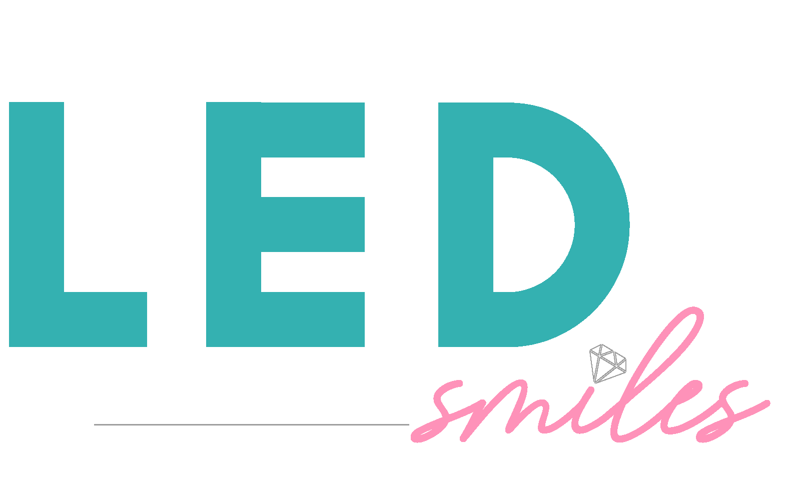
LED Smiles is a female-owned cosmetic whitening studio, specializing in teeth whitening education. Shayla Fears, owner, has years of experience and has transitioned from taking clients to teaching others how to master cosmetic whitening.
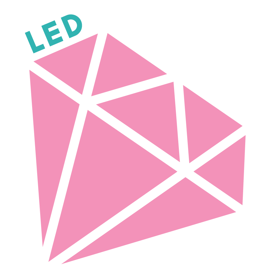
ALTERNATE LOGO
SUBMARK
COLOR PALETTE
ELEMENTS

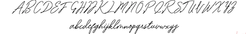
TYPOGRAPHY

SCOPE
LED Smiles originally booked graphic design only, but upon designing the digital content I realized I didn't have a cohesive brand identity to really design from. My client gave me complete creative control on developing a logo for her business. Inspired by the name and taking direction from her mostly female clientele, I developed visuals that were bright and welcoming.
DESIGN
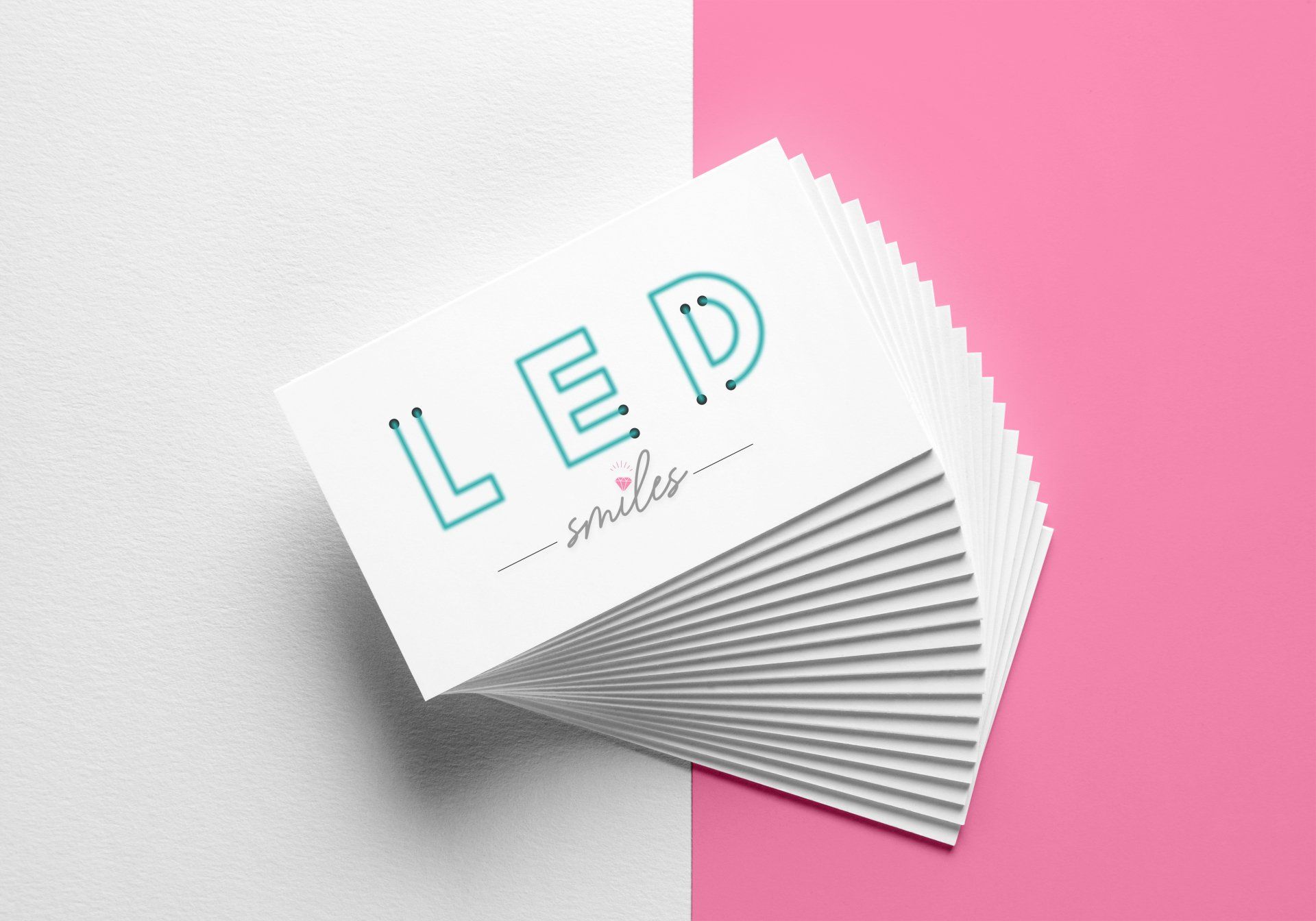
- Color Palette: The dental industry utilizes blues and greens, which communicate peace, health, and growth. I chose blue-ish greens that look like LED lights to play off of the name. Pink was added to appeal to the female clientele & express youthful femininity.
- Typography: "LED" was designed to look exactly like an LED light, I chose a bold font that has soft lines to create the light illusion. To balance the boldness of the LED typography, a clean script was chosen for "smiles". Script was most fitting for the word and the industry.
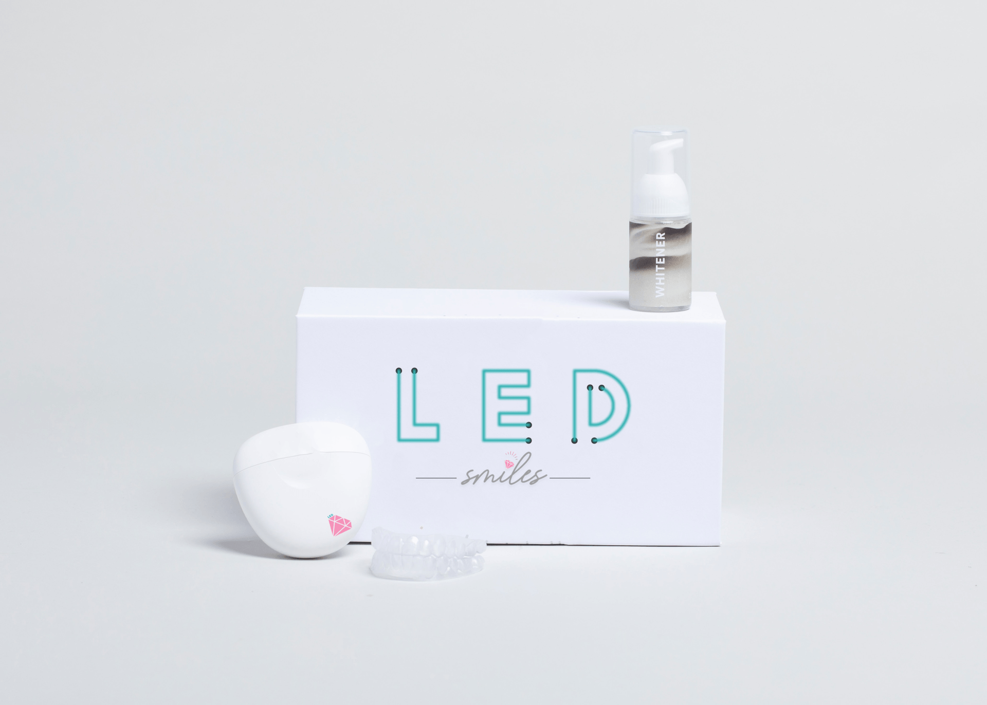
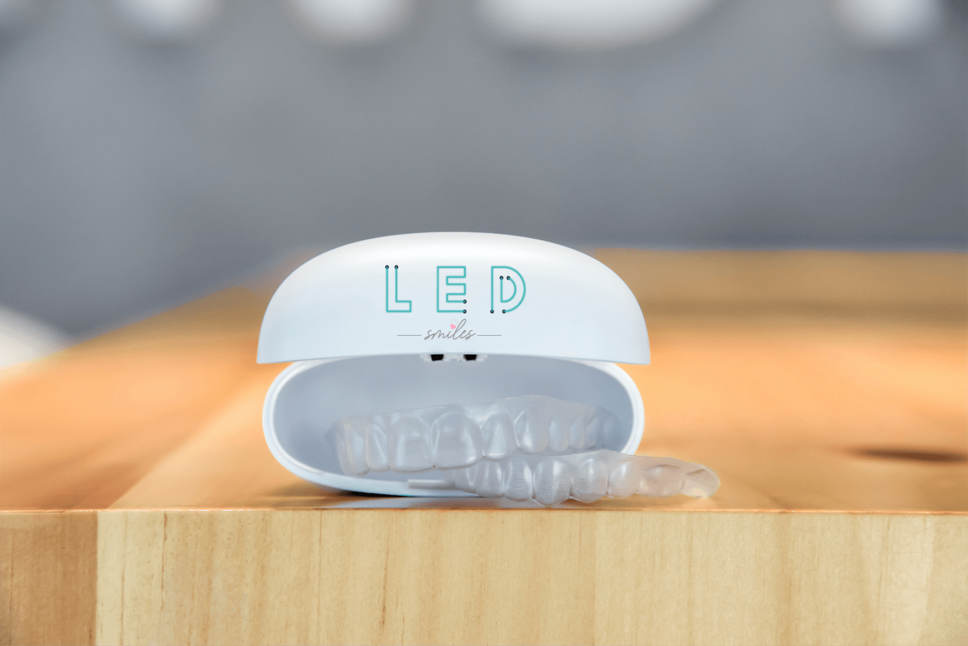
- Elements: The previous logo included a diamond, and my client was adamant about in being present in her brand visuals. Without it being too overwhelming, I incorporated a small diamond tucked away as the dot in the "I" within "smiles."
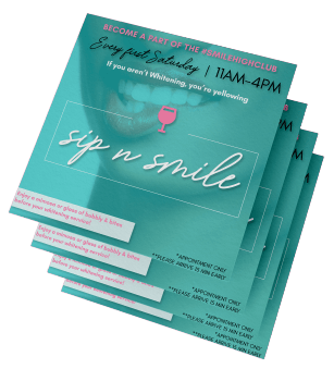
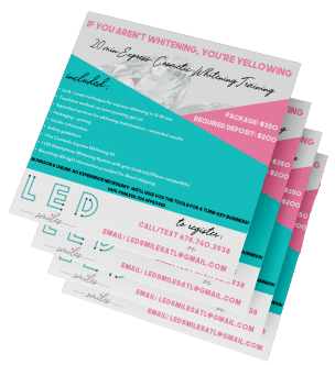
SOCIAL MEDIA DESIGN - DIGITAL FLYERS
LED Smiles has a pretty active social media presence, most of their clients and students come from Instagram, so I made sure to remain consistent while still creating fresh content for their Instagram feed.

RELATED WORK


